Designing and developing agents at Warp
Role
Design Engineer and PMTimeline
May - August 2026Team
Product TeamSoftware
Warp, Figma, MetabaseOverview
Writing code and shifting pixels: my summer at Warp.
During my summer internship at Warp, I worked across design, product, and engineering. My main projects included redesigning self-serve onboarding, building configurable design systems + internal tools, and tackling complex billing and usage problems.
Project 1: Self-serve onboarding
Rethinking onboarding for agent users, not terminal ones
Over the past year, Warp had grown from a terminal into an agent harness and 10x’d in usage. The issue was that many legacy users very much, and very vocally, wanted us to leave their terminal alone. As a result, our onboarding process gave so many ways for users to opt out of any AI features, and by extension, paying us.
Self-serve conversion rate
Alongside a product manager and an engineer, our goal was to answer: how might we rework onboarding to improve self-serve conversion? What follows is a mix of shipped and proof of concept work.
Theories
Some theories and hypotheses we had
Immediately, we had a few theories on what the probable issues in onboarding were. It was clear that the entire process was far too long, and gave users too many locations to opt out, but where were they, and what was necessary to keep? After digging through our Metabase data screen by screen, we arrived at a few conclusions.
01: Just don’t give users so many ways to opt out
We had four separate screens that let users opt out of paying us. You could avoid AI entirely, not pay for a plan, bring your own API keys, or skip signing in and just use Warp as a terminal.
02: Shorter is almost always better
Onboarding should not be the place to educate users on value prop. Most competitors got users through onboarding in just a few screens. We had closer to ten.
03: Onboarding should be opinionated
All paths should not be equally valid. We want people to use Agent Mode, ideally through a work account. That’s the revenue center; everything in onboarding should push users towards that path.
The solution
Onboarding reimagined for Warp the harness, not the terminal
Research
We knew that generally, we had to shorten onboarding, but there were still many open questions around what to remove, what to keep, and how opinionated the new flow should be.
What did our competitors do?
We don’t tend to base design on what competitors do, but as reference, most of our competitors had around 2-3 screens total for onboarding, with one being signup and the other being a pricing screen.
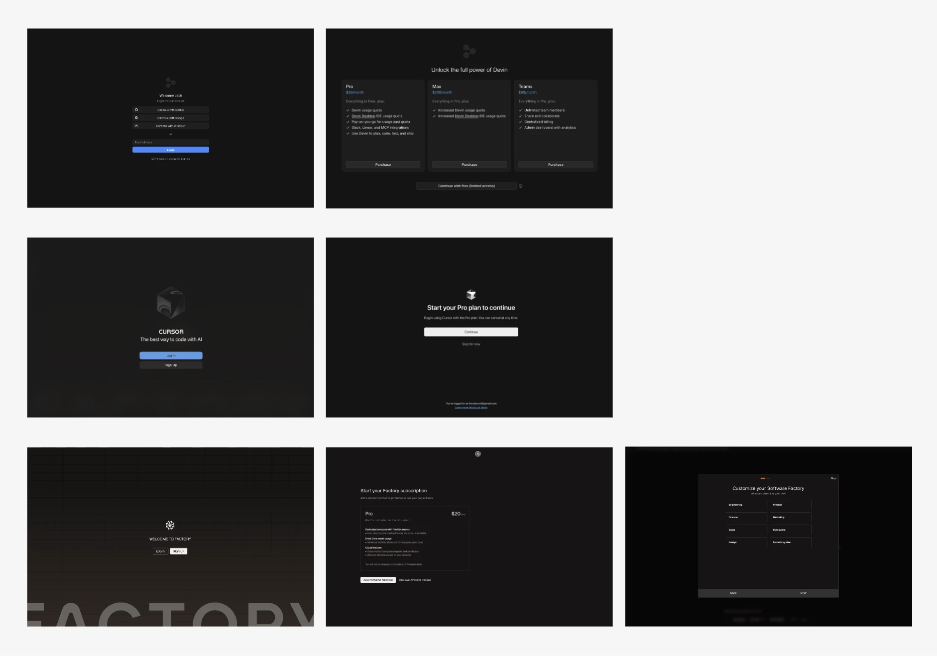
So immediately the thought was, why not just copy this and remove everything but signup and pricing?
The case for keeping customization and configuration
If shorter is better, why keep settings for customization and configuration in onboarding? Neither was technically necessary to start using Warp. But the data suggested these screens behaved differently. Users were willing to spend time on them, and people who made it through them were more likely to continue. I wanted to test this data a bit more, so with three variations laid out I set up a mock service worker environment to get some real user feedback.
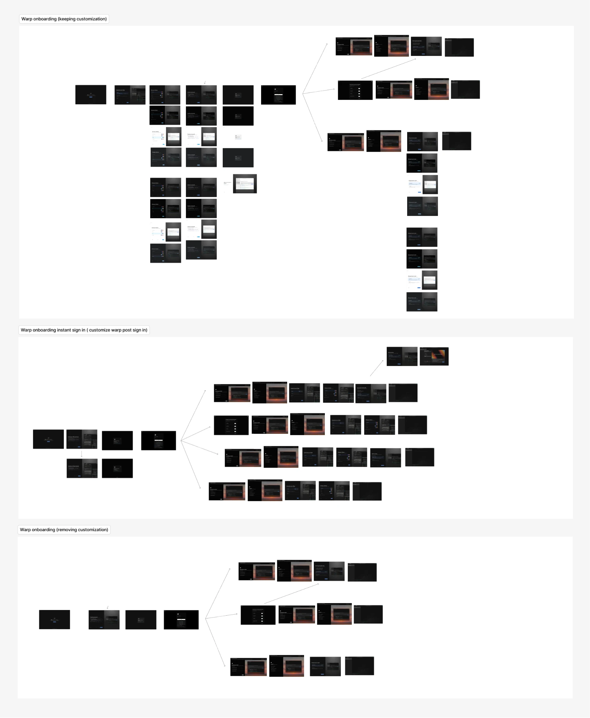
The results? Over 70% of users tested preferred keeping config and customizing in the same spot. This made intuitive sense too. Choosing how Warp looks and behaves is a small act of ownership. Instead of explaining why Warp was different, these screens let users make it theirs.
Visual Updates
Craft is something that I care immensely about. Not just in making something look better, but in designing for clarity of information and for user delight. I wanted onboarding, and especially configuration, to convey its effects more clearly through a small visual refresh.
Optimizing for our ICP group
A personal email and a work email told us very different things. Because authentication already happened during onboarding, we could use email domain as a lightweight signal of intent. I designed the flow to encourage work-email signup and then branch the experience for users who looked like a strong enterprise lock-in.
Results
The new flow was shorter, more opinionated, and much clearer about what Warp had become.
Improvements in self-serve conversion
The redesigned flow helped reverse the decline in self-serve conversion by making the path into Agent Mode shorter, clearer, and easier to complete.
Onboarding screens reduced from 12 to 4
We cut the flow down to the moments that actually earned their place, removing unnecessary education and pushing more value discovery into the product itself.
Opt-out points reduced from 4 to 1
Users could still choose the classic terminal experience, but we stopped repeatedly interrupting the happy path with ways to avoid Agent Mode.
More to come soon!